Being an online product owner, we’re faced with thousands of tricks and tactics we can test to improve our sales. This is called optimizing for your conversions and it’s crucial for the success of any business…
The issue becomes “what do you optimize”? With so many things and so many pages of your website and sales funnel, where do you focus to get the biggest optimizations for the efforts you’ll put in. And then you’ll ask yourself, “how am I going to make these optimization changes”?
I know this isn’t the sexiest of topics you could be reading, but like I said, this could be life or death of your business!
From the 10 years that we’ve sold products online, we’ve learned some massive things. When it comes to improving sales, we have learned that there is only ONE page you need to optimize to get 80% of your improved results and more sales.
What’s that page? Well, it’s the page that is overlooked because it’s the END of your funnel. It’s where product owners think they’ve already done the hard work to sell prospects, so it’s a slam dunk that they’ll convert to a sale.
The page we focus 80% of our optimization efforts on is our checkout pages.
This is the page where you either collect your hard-earned money, or you never see a penny of it. Studies have shown that an average of 67% of prospects land on a checkout page and leave forever without purchasing. Our goal is to shore up your checkout page and capture this crowd and increase the likelihood that they will purchase… and sooner!
So, let’s get into the 10 specific things you can do RIGHT NOW to optimize this ONE page and get immediate boosts in your conversions (we’ve seen up to 5 time higher conversions with these tips)…
The first section of optimizations will address this common issue that online business owners face: “How do I increase trust with my prospects so they actually purchase from me?”
Here’s how to quickly get over that hurdle…
Optimization #1: Use More Testimonials
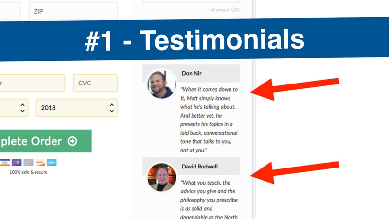
As Dan Kennedy (the highest paid direct response copywriter) has said, “you can never use too many testimonials in your marketing”. Make sure to show images of your customers and show a short quote of their results from using your product or service.
This is a basic marketing rule, but one that a lot of people overlook! If you don’t have any testimonials, just reach out to some of your most active subscribers/clients/customers and ask them for a small quote. This is enough to get things started and then grow from there.
The key here is to show how your prospects can replicate results that your previous customers have already experienced. This brings up the “if they can do it, so can I” factor. Try to do this as much as you can and you’ll quickly gain the trust of your prospects and sell more.
Optimization #2: Use Trust Elements On Your Checkout
When trying to gain trust with your prospects, you want to lay it all out so it’s obvious to them. You want to give them that warm and fuzzy feeling so they are confident with giving their hard-earned money to you.
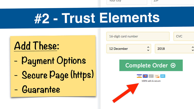
Here are the trust elements that are necessary for every checkout page:
- Show all payment options you accept for the purchase (examples: major credit cards, PayPal, Apple Pay, etc.) Use the symbols to show this under ‘buy now’ buttons or elsewhere near where prospects enter their credit card information.
- Embed an image or seal that shows that your checkout page is secure. Many people will leave a checkout page if they don’t see “https” in the address bar. Browsers like Chrome are now even showing “Not Secure” verbiage in the address bar on “http” pages. That will scare a lot of potential customers, so make sure to clear this up ASAP.
- Clearly state your guarantee on your checkout page. This is a quick way to gain trust and is a reminder that you have their back after they purchase.
This second section of optimizations will address another big issue all online product owners face: “How do I create better followup systems that will quickly turn into money?” Let’s dig into those simple optimizations now…
Optimization #3: Embed Live Chat
Using live chat features on websites are starting to become the norm. Potential customers want to have their questions answered immediately and their patience for waiting is getting shorter and shorter. Luckily, there are many live chat apps to use to fill this gap!
Some of those options include Olark and Tawk.to.
What’s awesome is that you can embed any of these onto your checkout page and allow prospects to click a button and get someone on your team (or you) to answer questions. If you aren’t around at that second, you can direct prospects to email you their questions. This is one of the biggest optimization factors we’ve implemented in our business. It’s a MUST and you’ll get great feedback from your prospects, too.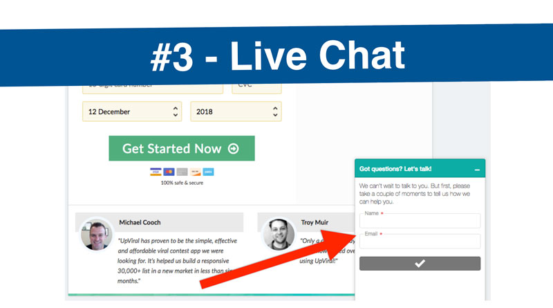
Optimization #4: Retargeting
This is still one of the most underutilized forms of marketing and it blows us away. Maybe it’s because people don’t understand how it works. Here it is in a nutshell:
- You install a retargeting pixel from Facebook, Google, and other sites on your checkout page
- Someone lands on your checkout page and that pixel/cookie is placed in their browser
- When someone leaves your checkout page without purchasing, you can now run advertisements to specifically target these people
Boom! This is THE most targeted form of marketing to the most likely to buy prospects. At this point, you are not going after a cold audience. These folks have seen your product and just need a final “push” to get them to buy. When you pair up this type of marketing with your checkout page, you’ll start to see your conversions skyrocket!
Optimization #5: Chatbots
Using chatbots in your marketing is something new to business owners. It’s new technology that hooks in with your website and Facebook to communicate with your prospects in a whole new way. Here’s the scoop on what chatbots are and why they’re important:
- They can integrate and embed straight onto your website in many ways (popup, exit intent, live chat embed, and more)
- They are a new way to grow a database so you can communicate with people later (based off of tags and automations)
- You can use the live chat feature to answer any questions immediately (this is our favorite way to close deals)
The beauty of using chatbots on your checkout page is that they allow you to answer any objections immediately. You can do this live or automate responses (you can get really creative with your marketing here!)
Our favorite way to leverage the use of chatbots is to run retargeting ads on Facebook (as mentioned above) and direct people to message us. When they message us on Facebook, people immediately get added to our chatbot list and we can chat with them. This allows us to target the most interested prospects that are just needing some extra handholding before they make a purchase. This is where we see our highest ROI.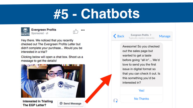
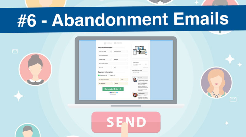
Optimization #6: Abandonment Emails
This might be a totally new concept to people, but I’m sure you’ve had this kind of marketing applied to you in the past. Here’s the deal with abandonment emails:
- Prospects enter their contact details (including email) on your checkout pages.
- If people spend a certain amount of time on the checkout page but DON’T purchase, they can be added to your email list under an abandonment email sequence.
- This sequence can start immediately after they leave your checkout page. These emails could be a sequence of emails that urge them to come back and complete their order.
- This sequence/tactic can be a little technical if you don’t have the right systems (but don’t worry, I’ll show you how to do this easily a bit later).
These abandonment emails rock because it’s just another way that you can follow up with people who are VERY interested but didn’t purchase yet. They were so interested that they actually entered some of their contact details in. There’s no reason why you wouldn’t want to email them and urge them to buy!
This last section of optimizations will address this lingering question for most online business owners: “How do I get people to buy RIGHT NOW and get a maximum ROI per customer?”
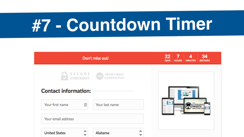
Optimization #7: Embed A Countdown Timer
Countdown timers are key to increasing the scarcity of a product (this works great with digital and physical products). When you increase the scarcity of your product, you are telling the customer that they need to make a decision RIGHT NOW and not hesitate. They can lose out on the opportunity to get your product at a special price or within a certain quantity that you’ve set.
Here are the most effective ways we’ve used countdown timers on our checkout pages:
- Time scarcity (set a specific time as a deadline or start the timer when someone lands on the checkout page, so it’s unique to the person)
- Quantity scarcity (when your product has sold a certain amount of times, the offer can close)
- Show a call-to-action message next to the timer (tell them what to do and remind them of the scarcity)
- Close the offer or redirect to another offer when the countdown reaches zero
Optimization #8: Use Coupons
Coupons are a no-brainer for most brick-and-mortar companies, but it blows us away when online product owners don’t use these in their marketing. Many people don’t want to discount their products (and this makes sense), but there are other effective ways to use coupons that will help facilitate a sale NOW. The key is to get a buyer now rather than later (when it costs you more money with marketing and the time of waiting).
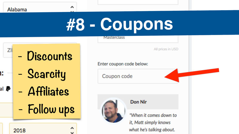
Here are some types of coupons you can use on your checkout pages to increase conversions:
- Discount-based (set a fixed or percentage discount for coupon codes)
- Scarcity-based (you can set a specific time or quantity of products that can be redeemed with specific coupons)
- Affiliates tracking (you can use coupons to credit affiliates when they make sales and you can set up unique offers for specific affiliate partners)
- Add buyers to specific follow ups (based on coupons that people use upon purchase, you can add customers to specific autoresponders/lists and followup/upsell them to more products)
Optimization #9: 1-Click Bump Offers & Upsells
If you’re looking to boost your value per customer (which is everyone is looking to do!), this is key. The goal shouldn’t be to just have people buy your front-end product… that’s just the beginning of people’s buying experience. When you think about how much money and time it takes to acquire a customer, you’ll quickly realize that you should give people more options to give you more money. That’s done with upsells and higher-priced offers.
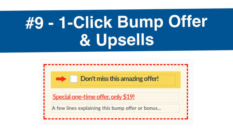
Our favorite way of doing this is to offer 1-click bump offers and upsells. Let’s start with bump offers…
Bump offers are when you give customers an option to select a tick box on the checkout page. After someone enters in their contact and payment information on the checkout page, they can select this tick box and add another product/add-on to their order for an additional cost. The checkout page will automatically add this new cost to the overall price. When someone completes their order, they will get charged for that total amount.
We typically see a 50% uptake when we offer a bump offer on our checkout page. That’s AMAZING!
When you use a bump offer, you’ll typically want to offer a no-brainer type of add-on that will be used with the main product they just purchased. For example, if you’re selling a book for $20, your bump offer could be the audiobook version for an extra $10.
Upsells are pretty straightforward. The key is to design your checkout process with 1-click upsells. This means that when someone “completes” their order on the checkout page, they will immediately see the upsell page with your additional offer. If your customer chooses to buy that upsell product, once they click the buy button, it will bundle the entire purchase into the transaction and charge the customer at one time. There is no need for the customer to re-enter their contact and payment details again. This will result in higher uptake/conversions on the upsell and you’ll make more money per customer!
Optimization #10: Offer Multiple Payment Options
No one wants to be stuck with only one option to pay for something. Most prospects will like to see a couple of options to purchase an offer, especially one that is recurring or a subscription product.
Some examples of multiple payment options you can show on a checkout page could be: One-time, monthly, annual, split-pay, pay your own price.
There are benefits for prospects to select one option over another option (they might want to spread out payments, receive a discount for an upfront full payment, etc.)
The key here is to get creative with your pricing and give your prospects flexibility when asking for their money!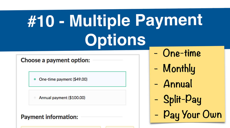
And there you have it, those are the top 10 optimizations you can do in your funnel (and luckily, they are all done on ONE page)!
Here are all optimizations in a condensed list for you:
- Use testimonials to show the “I can do it, to0” effect
- Embed trust elements
- Use live chat to answer questions
- Retargeting ads go after your hottest prospects
- Use chatbots to grow a new, targeted list and followup with prospects
- Abandonment email sequence to email the hottest prospects
- Embed a countdown timer to increase scarcity
- Use coupons to discount, track affiliates, and increase scarcity
- Add in 1-click bump and upsell offers to increase your ROI per customer
- Add in multiple payment options to give people their favorite way to pay you
Here’s what’s really cool (and extremely helpful for you)! All of these optimizations are not only done on one page in your sale funnel, but they can all be done with ONE TOOL. Sure, you could go and do this the hard way (using a lot of design and crazy coding), or you can go the easy route and use a tool that was built to do it all quickly…
To make this process EXTREMELY quick and simple, we use a tool called ThriveCart. It’s the only solution you need to fully take advantage of all points we covered and it has been proven to immediately increase sales numbers for thousands of online business owners, like you.
There’s a reason why you clicked into this article and are still reading this far down. You want to increase your sales conversions, and now you know WHAT you need to do… this is your HOW.
Right now, you have the unique ability to get into Thrivecart with just a one-time fee for a lifetime license. This is not going to be around forever and is going away in a month or two. At that point, you’ll need to pay annually or monthly to get access.
To sweeten the pot a bit more for you (even though it’s not necessary), we’ve put together some exclusive bonuses for people who purchase from us (we are the only Certified Partners of Thrivecart). You’ll get immediate access to all bonuses found on this page: https://getthrivecart.com/bonuses/
Grab Thrivecart today and start implementing all of the sales conversion strategies we’ve mentioned above. If you have any questions at all, just click here and start a chat with us.

